
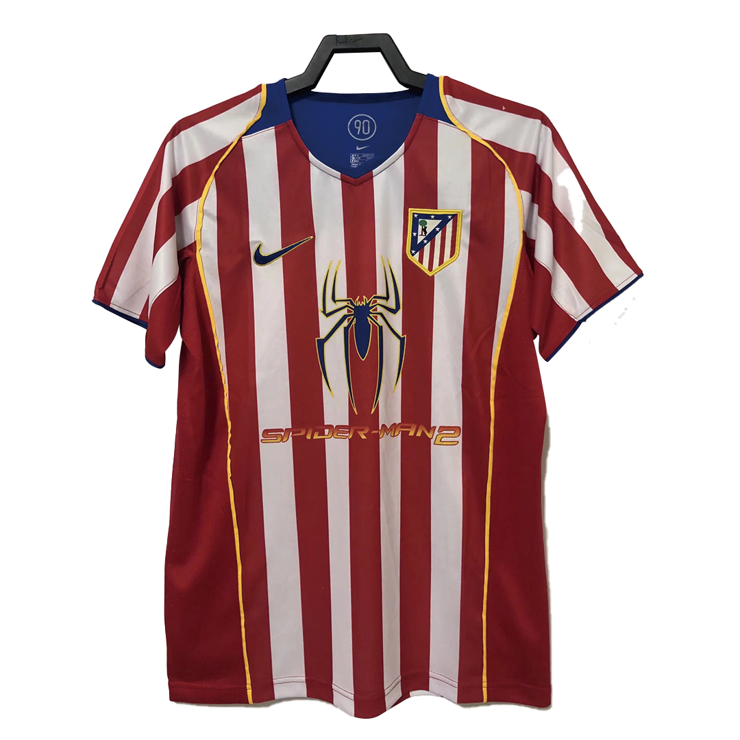
A colour name is a useful beginning, but a football shirt never presents that colour in isolation. Red appears beside another colour, at a particular width, within a collar or around a badge. The relationship can matter more to the composition than the name of the colour itself.
Keep the red, change its neighbour
Consider the Barcelona 2003/04 and Atletico Madrid 2004/05 references in our archive. Both present red within a striped body. In one, dark blue is a major companion; in the other, pale stripes provide a much lighter contrast. The two arrangements offer different rhythms even before the smaller details enter the picture.
This is a comparison of the photographs, not a colour-matching exercise. The images were not made under identical lighting, and their colour values should not be treated as calibrated samples.
Describe an area, not only a palette
Ask how much space each colour occupies. A narrow edge can act like punctuation; a broad panel can become the page on which the other elements sit. Then look at where that area appears. A dark neckline and a dark side panel may use a similar tone while guiding attention in different directions.
Try a sentence built around a relationship: the dark collar holds the top of the composition together; the light stripe creates a pause between darker shapes. Such a sentence explains what you are noticing without presenting personal interpretation as a historical fact.
Allow the comparison to remain specific
Two reference images cannot stand in for every shirt produced under those club names. Avoid turning a small observation into a rule about a whole club or period. The value of the comparison is its precision: these images, these arrangements, this particular way of looking.
Look at the Barcelona reference, then open the Atletico Madrid reference. Give each three lines: the dominant relationship, a secondary contrast and the detail you noticed last. The resulting pair of notes may be more memorable than a list of colours.